Every business needs to use large aesthetic banners for business promotions. Banners are incomplete without bold design, striking color schemes, and captivating statements. Every industry should know about its targeted audience and other ways that need to be taken care of while creating artwork for a large banner. Here we are going to let people know how to create an artwork for a large banner and how to make it more exciting to grab customers’ attention. Let’s get into this blog.
Clear Understanding is important
While designing a large banner for the business, it’s essential to have a clear Understanding. Artwork for banners requires increasing brand awareness and highlighting targeted products. Whatever type of banner is created raises awareness for a social cause. The more precise you have the idea, the greater potential your banner will have to get countless customers. Everyone needs to know about the purpose of the banner before going into the design phase. What else do you want to achieve through this?
Pop-out your banner from others
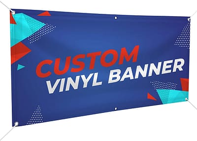
Your banner should pop out from others in your surroundings. Every business needs to know the essential elements of the banners, and they should have the potential to get passerby’s attention. Always design the banner with an eye-catching color scheme. Get to know where you are hanging your banner, and then choose the color scheme by keeping surrounding banners in the notice. Artwork should define your brand properly; the color scheme could be better than the ordinary colors of other large banners.
Don’t compromise over the color game
The color scheme will uplift the appearance of the banner. If you want to make your large banner the talk of the town, then never compromise on this element. Color associations and preferences vary from client to client, so sit with them and discuss their perceptions. Usually, people prefer the color scheme the same as their website. This is completely fine, but ensure all the features are correctly designed.
Color settings are essential, and know what else needs to consider for this:
- The artwork for the banner should be in a CMYK color format.
- Save photograph data in RGB.
- Print presses use a CMYK process and convert any image to CMYK
It has been seen color conversion can affect the color scheme of the original image. You should convert images to CMYK before placing them into Illustrator files.
Make Text Readable From Distance
If text over the banner from a distance is not clearly readable, it definitely leaves a negative impact. This design tip is essential for all types of banners which are created for outdoor purposes. Every text should be 10 inches to be readable at a distance of 100 feet. Make sure no passerby should have any trouble while reading the message on the banner. Some script fonts are challenging to make, so choose the typeface that is easy to read and keep the copy on the artwork to a minimum.
Image Resolution
Image resolution for large banners differs from artwork for business cards and letterheads. Image to look clear and sharp and you need to use the right type of file with sufficient resolution. Banners artwork at 300 dpi creates huge process time for your computer. Don’t create artwork for large graphics at stationary DPI is not recommended.
You should know the following file types to be aware of:
Vector
Vector images are line art graphics that maintain quality; it doesn’t matter how you resize them.
Raster
Raster, bitmap images are tiny dots that form a picture. These images can be enlarged at a certain amount before lowering clarity.
To create a graphic for a banner, make sure you save it as a vector file. Image won’t lose clarity when it’s enlarged, and if you are using a photograph or any raster image, including .jpg and other common file types, make sure the file isn’t compressed.
Pay Attention to Clear Focal Point
Artwork for large banners should have a clear focal point and use a bold color on a particular image to make it stand out. Bold or capitalize the text to draw people’s attention to a specific word or line. Make an emphasized portion, whether a text or an image. It has been seen larger images will immediately attract more attention than smaller details. You should decide first where your banner’s focal point will reside.
The focal point will hook the people’s attention before looking at rest of the banner. It’s up to you to lower the dpi around 80-100 dpi with supersized banner dpi. If you are unsure about the dpi of artwork, then zoom in and look at the quality of your artwork at 100%.
Final Thoughts
These are the essential things to consider while creating artwork for large banners. Experienced designers know what type of best materials should be used for banners. Get the expertise of the best professionals who know how to live up to the expectations of their clients with vibrant images and colors.

